April 2026 · visualization
Every street tree in Toronto, as a dot
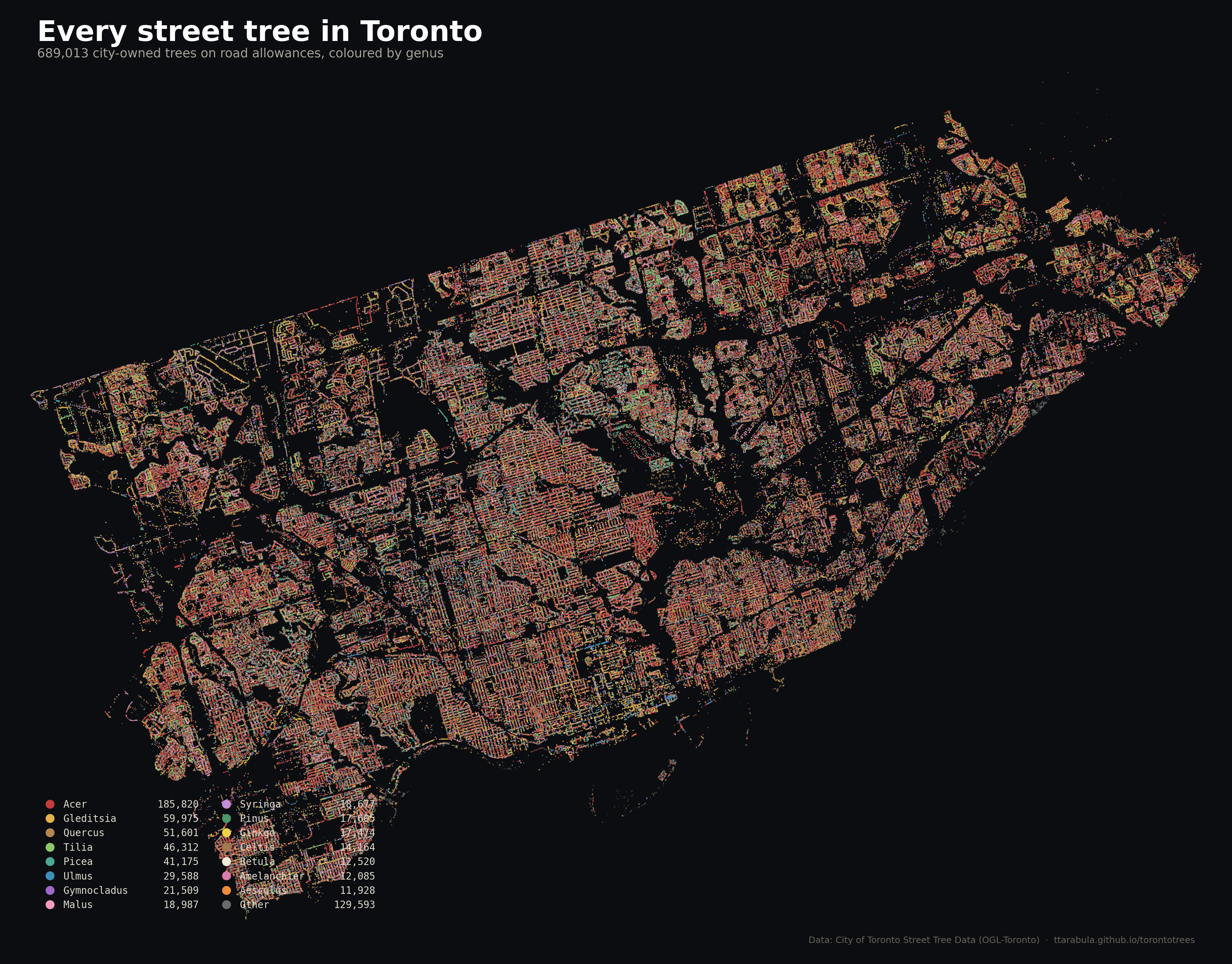
The City of Toronto maintains a public inventory of every street tree it owns — 689,013 of them, one row per tree, with species, size, and location. I plotted them.
The City of Toronto maintains a public inventory of every street tree it owns — 689,013 of them, one row per tree, with species, size, and location. I plotted them.
A few things jump out.
The street grid is visible in the dots. No basemap needed. Trees follow roads, and roads follow the grid, and the grid folds around ravines. The big dark voids are the Humber, the Don, and the lakefront parks — no road allowance, no dataset entries.
Red dominates. Red is Acer, the maple genus. 185,820 trees, 27% of the whole inventory. Toronto is a maple city on paper and a maple city on the ground. Half of that red is one invasive species — the Norway maple — which we'll get to.
The north-west glows yellow-green. That's honey locust (gold) and littleleaf linden (green) — two of the city's go-to post-1970 plantings. North Etobicoke, Weston, and Humber-area subdivisions were built during a planting era when the city preferred these narrow-crown, wire-tolerant species over maples.
The old downtown is mottled. Smaller, older residential neighbourhoods west and east of downtown have the most visual diversity — mix of reds, golds, browns, greens. A century of planting decisions, layered.
Here's the same map, except only one species is highlighted:
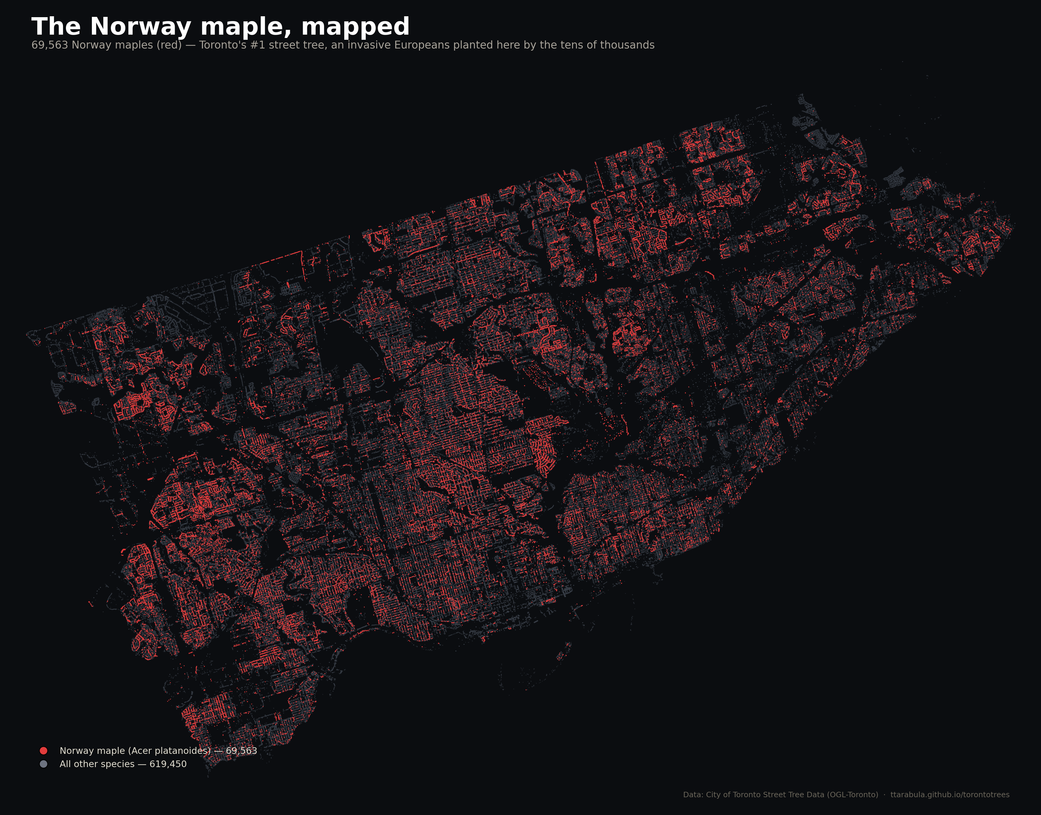
The red cloud is Toronto's most-planted street tree. Norway maple is not on the city's current planting list. It's an invasive species from Europe, outcompetes native maples in ravines, hosts far fewer insect species than native oaks or willows, and casts such dense shade that almost nothing grows underneath. The city stopped planting it years ago. But 70,000 of them are already there, 50+ feet tall, 40+ years old, and you can't just rip them out.
Where the cloud thins — downtown, the waterfront, the newest subdivisions — is where the city has either replaced older plantings or never planted Norway maple in the first place. If you want to watch the species retire over the coming decades, this is the map to bookmark.
689,013 dots in one image. Each dot is about 1.5 points across, plotted with matplotlib at 180 dpi. The whole render takes about 20 seconds. For a city of 2.8 million people, it's one tree every four Torontonians — a pretty good ratio, even if the distribution (see the canopy-equity analysis) is uneven.
This is street trees only. Parks, ravines, and private property are not counted — maybe 60% of Toronto's actual canopy lives on those. So the real map of "every tree in Toronto" would be roughly 2.5× denser, with the biggest gains in ravines and backyards.
Watch 125 years of plantings, one year at a time.
Open the canopy timeline →Find the dot that represents your tree.
Search an address →